Hi there.
Today we're launching an updated look for Gitter. It's cleaner, simpler and makes the popular All conversations view and direct messages more obvious and usable.
TLDR: Try it out here. It's only the web and desktop versions that have changed, the mobile application and mobile web bits are still exactly the same. You can switch it off here. To enable it for your desktop version, take a look at this Topic.
After reworking the UI earlier in the year many thought we had taken away the single view across all of your conversations. Some people didn't like the heavy feel of menu navigation.
Today is the first step in fixing some of these issues.
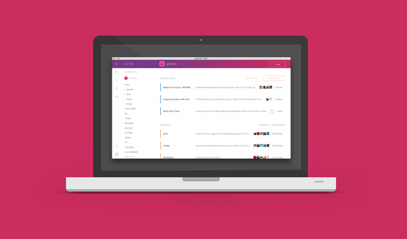
The UI has been completely cleaned up. You'll notice it's pretty white, fear not; some darker and coloured themes are in the works and will be rolled out soon.
We've simplified the primary menu navigation on the left and added a notification badge to the All Conversation view. Accessing a community is now an extra click away, but with added text descriptions as opposed to often cryptic and confusing icons. To strike a better balance here, we will soon be adding shortcuts to your favourite communities, so this should make navigating your regular communities pretty simple.
You'll also notice the community home pages (like this one) have been given a facelift.
This is still a work in progress. We'd love to hear your thoughts. Feel free to drop by gitterHQ/gitter or why not test out and create a Topic in our community.