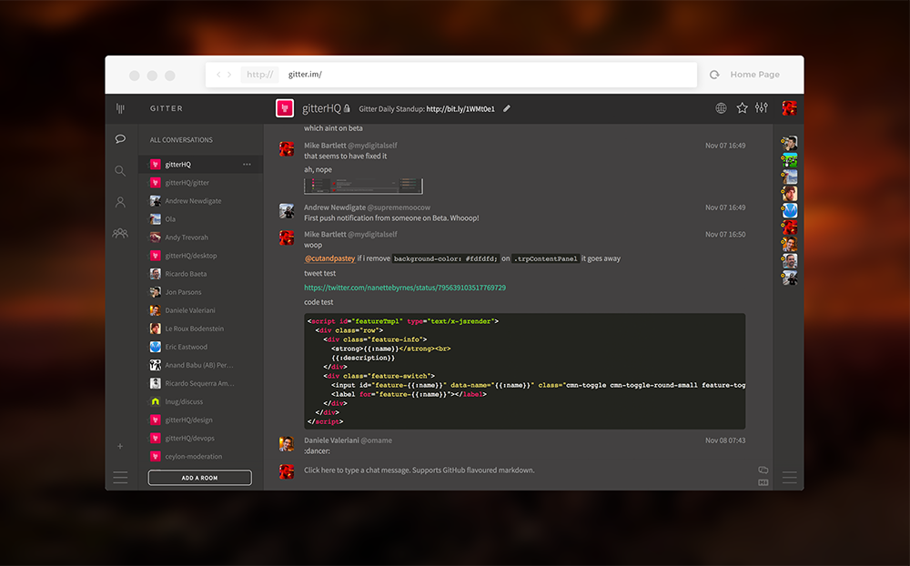
Today we are rolling out some changes to our UI. For those that haven't already played with it, you'll notice it's very white. We appreciate that a lot of developers like working in darker environments and so we've introduced a dark theme.

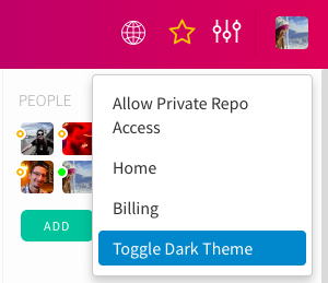
In order to enable the new theme go to the Profile menu - click on your display picture in the top right section and toggle Dark Theme.

The new UI includes improvements to the All Conversations view, which now has an indicator for unread messages and is the best place to find all of your chats.

Your list of communities is now in a more readable format under the My Communities icon:
![]()
You can also add shortcut links to communitunies by dragging them from the My Communities view onto the menu bar on the left, or by starring them in the same view.
We hope you'll enjoy this new look. Feel free to pop by GitterHQ and let us know what you think!

